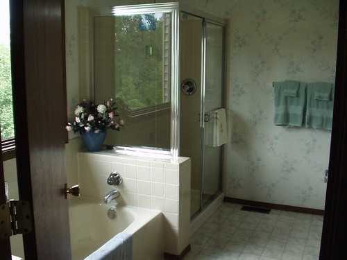
After:
I know, in this picture my after might not look as polished as the before. Let me defend my simpler choice here for a moment. First, that flowery wallpaper was especially horrible up close. It is indefenseable in a bathroom that a man will be using every day.
Second, why would you put wallpaper in a master bathroom? It was a nightmare to remove because the previous owners had repasted it at the seams over and over again and it tore the wall up when it was removed. Any wallpaper in a bathroom where the shower gets used multiple times a day will not stay up on the wall without peeling at the edges. Dumb.
Third, it had a white background and the vanity/sinks and tiles are a sandy yellowy off-white. Yuck. They put in a flooring (you can see it in the before) with white and blue in it to try to tie it in, but it just looked like a big arm wrestling match between the two schemes.
It's not perfect--the floor still doesn't quite tie in, but now that the ceiling color ties in the tiles and the vanity and the walls pick up the blue in the flooring, the floor almost recedes away and isn't quite as objectionable. Also, the blue towel in the after is going, to be replaced with a sand-colored one that matches the ceiling almost exactly. Those towels are in my dryer at the moment, and I couldn't stand to wait for them to finish before I took my after picture. Just imagine a perfect sand-colored towel there, because that's what'll be there in about an hour.
It was a nightmare project that took me a month in real time to complete, mostly because I could never work on it for very long with a baby to take care of. It may not be perfect. There may be some places where the paint got on the trim a little or the line at the ceiling isn't perfectly straight. But of all the things it is and isn't, the most important thing is that it is...done!


2 comments:
old and busted....new hotness.
Nice job btw, it looks like a nice beach seafoam bluegreen
Great improvement! Love the color. Shower + wallpaper = bad, what were they thinking?
Post a Comment